BLUETOOTH DEVELOPER STUDIO 2.0
Skills: Research, Content Coding, Visual Design, Prototyping, Usability Testing, UX, UI, IA
Tools: Illustrator, Photoshop, Axure, Balsamiq, Trello, PC and Mac environment
My Role: Principal UX Designer
Research (user interviews, comparative analysis, heuristic evaluations)
Planning (concept maps, affinity diagrams, personas, scenarios, user flows)
Design (low, mid and hi-fi wireframes and prototypes)
Testing (mid and hi-fi usability testing)
Iteration (design improvement from sketches to redlines)
Timeframe: 14 months
Client: Bluetooth SIG
Bluetooth Developer Studio 1.1
DEFINING THE PROBLEM AND 2.0 SCOPE
Developer Studio’s purpose
The Bluetooth spec is complex and creates a high entry threshold for Bluetooth engineers and developers. Developer Studio is designed to lower that threshold through a highly graphic developer interface.
The challenge
Make a complex engineering specification approachable for Bluetooth Developers. Increase simplicity, usability and learnability within Bluetooth Developer Studio 2.0.
Business requirements
Allow users to develop functional Bluetooth GATT and GAP based profiles, services and characteristics in a desktop app
Facilitate Bluetooth Spec learnability
Increase the usability of Developer Studio
Bring the UI into Bluetooth brand alignment
RESEARCH
Quantitative research efforts
SUS survey to 5,400 Developer Studio users
206 respondents, 67 usability comments, SUS Score 59.4
Member survey to 1,389 Bluetooth members
267 respondents, 23 usability comments
Qualitative research efforts
14 User interviews
Heuristics evaluation and IA of Developer Studio
Scenario based user flows
Comparative analysis and heuristic evaluation on Avion, Kinetise and Perfecto apps
Content coding the data
Data gathered was run through content coding exercises including affinity diagrams, concept map exercises, user scenario and user flow exercises.
PLANNING
Stakeholder alignment and buy-in
Throughout the research and planning phases stakeholders were involved in discovery workshops, research presentations and design critiques. This allowed iterative adjustments, alignment and buy-in.
What the affinitized research told us
Developer Studio has an overly complex UI
Users get lost within the app
Help was confusing because it lacked context
Lack of differentiation in profiles, services and characteristics created frustration
Meet Jobin and Rob
Based on the data these are our primary and secondary user personas. The culmination of quantitative and qualitative research efforts. An tertiary persona also emerged but represented less than 10% of users.
DESIGN
The strategy to reduce user friction
A tree navigation structure will provide structure and clarity
Contextual help will give users a lifeline
An optional guide will walk users through the UI
Links directly to the Bluetooth spec will increase learnability
Simplified and updated U/I will facilitate workflow and user satisfaction
Sketches
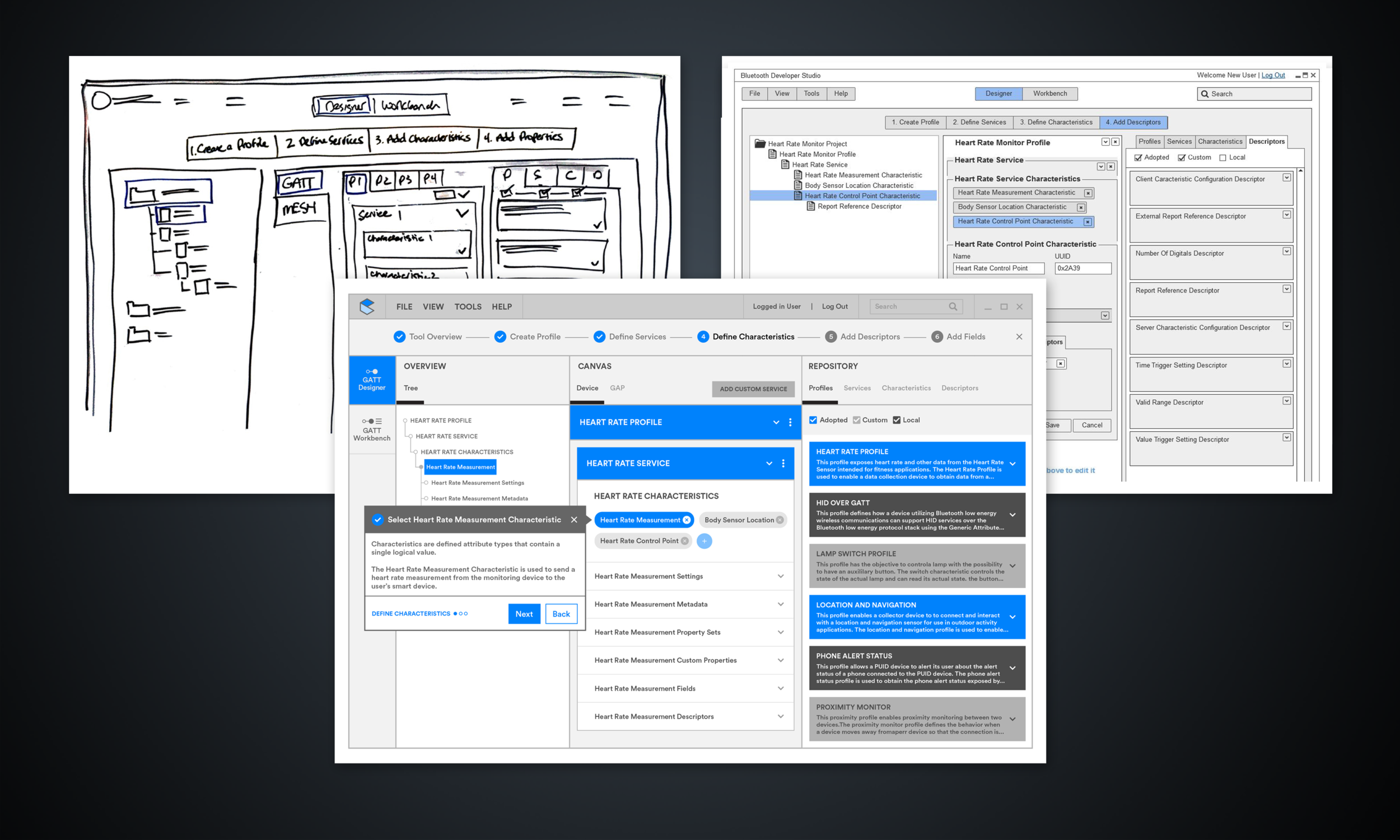
Simplifying the UI was explored through whiteboard sessions, user flows, IA exercises, UX team brainstorm sessions and feasibility discussions with Engineering. Once a workable solution was discovered as a team we decided to leverage a slight variation of Google Material for the UI components.
Prototype and mid-fi design
An early stage Balsamiq prototype was created and tested to test usability of the design concept. We stuck with what worked and iterated on what needed improvement. Mid-fi design files were created in Adobe Illustrator.
Prototype and high-fi design
The mid-fi design files were then used to create an Axure prototype to further test usability and clarity of the U/I including the tree view, contextual help, the guide and the idea of links to the Bluetooth spec.
TESTING
Mid-fi prototype testing methodology
Seven Bluetooth University attendees were asked to complete three separate tasks.
Create a Heart Rate Monitor Profile
Add a Heart Rate Service
Define the Heart Rate Characteristics
The usability test results
Overall the users felt the prototype was easier to use. It also took less time than anticipated to complete the assigned tasks.
Users liked the simplified U/I and design
The guide needed to be bigger and more robust
Help needed improvement
Hi-fi prototype testing methodology
Seven Bluetooth Developer 1.0 users were asked to complete three separate tasks.
Create a Heart Rate Monitor Profile
Add a Heart Rate Service
Define the Heart Rate Characteristics
The usability test results
Overall the users felt the prototype was easier to use. It also took less time than anticipated to complete the assigned tasks. They felt the guide was very clear. Users also felt the differentiation of Profiles, Services and Characteristics was clear.
Users wanted better separation between content cards
Only the canvas and content cards selected in the tree view should be visible
The guide should auto advance when a task is completed
The floating action button placement was confusing
ITERATION
User feedback addressed
The design was taken to final design and redline for release with several enhancements based on usability testing feedback.
Profile, Service and Characteristic cards were separated and given color to help differentiate them
Only selected tree view items show in the canvas
The guide requirements were changed to ensure they auto advanced
The floating action button was moved and had color added


