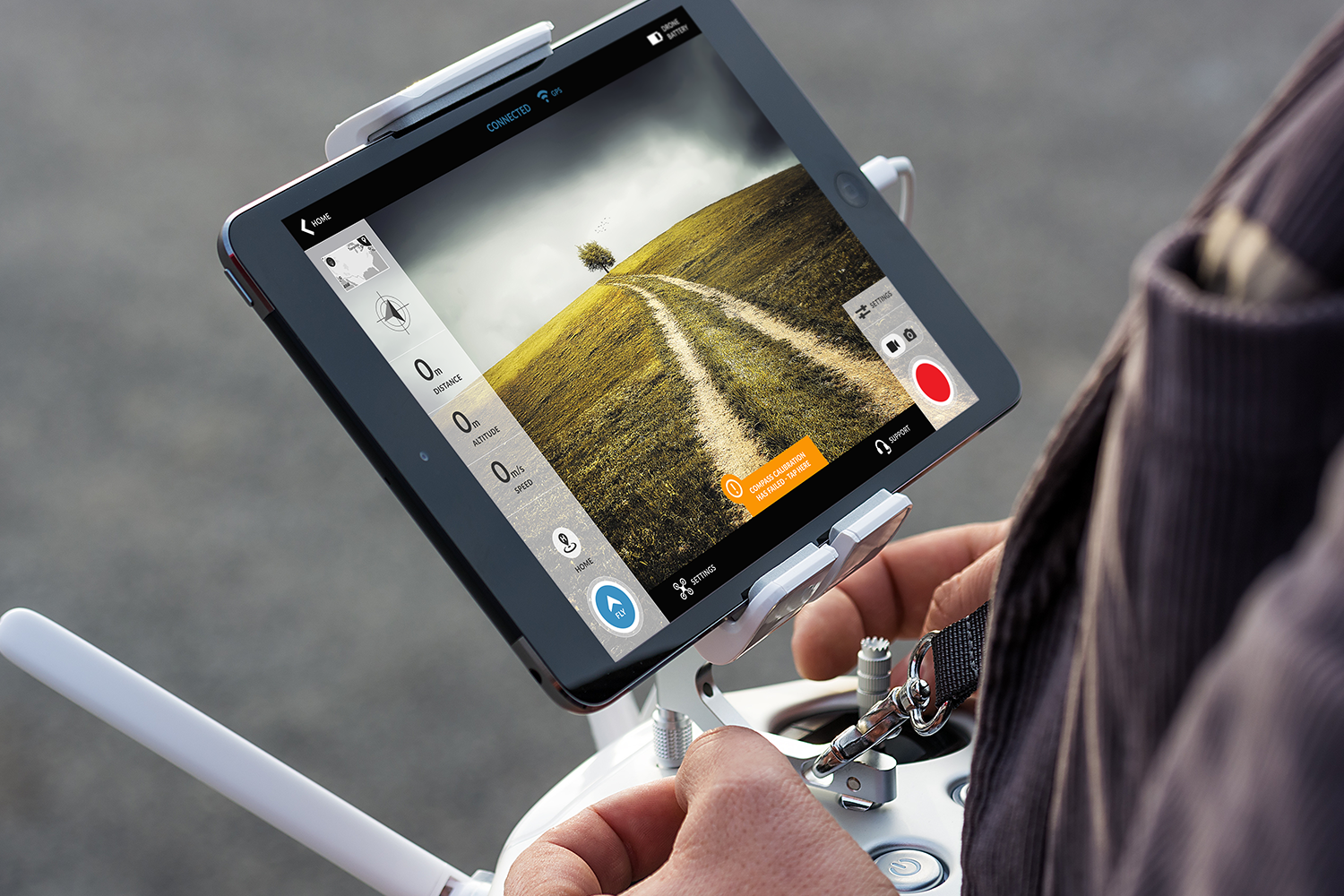
AUTEL DRONE SUPPORT APP
Skills: UX, UI, IA, Research, Content Coding, Visual Design, Prototyping, Usability Testing, Agile Methodology, Client Contact
Tools: Illustrator, Photoshop, Axure, Google drive, Slack, Trello
My Role: Facilitated an Agile Workflow, Research (User Interviews, Comparative Analysis, Heuristic Evaluations). Planning (App Map, Concept Map, Affinity Diagram, User Flows, Wireframes). Design (Usability Testing and Iterative Improvement).
Timeframe: Three weeks
Client: Autel Robotics
THE CHALLENGE
Quality and clarity
Position Autel as a rising leader by integrating best-in-class support into the existing drone application. Keep the user flying with a clear UI and relevant support content.
OUR APPROACH
Minimum viable product
Support/help applications can be extremely dense, making the discovery of relevant content a challenge. Our goal was to keep content concise by addressing the top issues and expanding content from there.
User centered design
By interviewing Autel users and conducting Contextual Inquiries at International Drone Day, we gained insight from a broad spectrum of users to understand the different perspectives of getting help in the field.
RESEARCH PARTICIPANTS
Helping users under tension
Users had high expectations when arriving at the field to fly. Drone problems created tension and the emotional state of our users dipped. Helping users in this state was going to require reassurance and quick solutions to issues.
USE CASE EMOTIONAL JOURNEY
CONTENT CODING RESEARCH FINDINGS
Defining our user through emergent themes
During User Interviews and Contextual Inquiries, conversations were guided by an ever narrowing set of questions to understand motivations, needs, likes and frustrations. Through Card Sorting, Affinity Diagrams and Concept Maps we were able to reveal some interesting insights.
MEET OUR PRIMARY USER PERSONA
What the data told us
The majority of our users were split between advanced and expert, but we choose not to pursue this user as our primary persona. Expert users modify their drones — sometimes radically. This evolves them out of typical support resources quickly. Additionally, Autel is an emerging drone company and wanting to grow their customer base by several thousand users. This means our primary user encompasses adopters through intermediate flyers.
THE TWO USER SCENARIOS
Compass calibration failure
Michael is in the field getting ready to fly when the he gets a "Calibration has Failed" error on his app. He wants to get back flying quickly.
Controller low battery
Michael is in the field getting ready to fly, he uses the controller to lift off. The drone will not take off. There is no system error so he contacts support through chat. He wants to get back flying quickly.
USER FLOWS AND USE CASES
Walking Michael through the support process
We needed to create a real world scenario in which both troubleshooting and live support were necessary to resolve the issue. This flow had to produce great data to inform our MVP Prototype.
PLANNING THE DESIGN COURSE
From card sorting to Information Architecture
Leveraging User Research and Card Sorting exercises we landed on the content and flow of the Information Architecture. The decision was made to stay focused on the Fly Screen through Support.
SKETCHING MICHAEL'S APP AND INTERACTION
Creating content zones and the app framework
The design for "fly mode" needed to afford users easy access to the app controls while simultaneously working the controls on the remote. The screens help build the framework for the other categories within the support navigation.
V1 DESIGN AND PROTOTYPE
Following the use cases through the prototype
The Prototype was designed to walk users through the two use cases to determine our final support categories. Design and functionality were also tested to identify improvements for the next iteration.
CHECKING IN WITH OUR USERS
Usability testing feedback
Users wanted to self-solve issues
They went to "Troubleshooting" first when encountering an issue
This was followed by "FAQs" and "Videos"
No one used "Ask the experts"
Users contacted Support as a last resort
"Phone" was preferred over "Chat" when contacting Support
Improvements addressed
The navigation was reduced to our MVP with "Troubleshooting" and "FAQs" content
Interaction design and navigation were improved to be more in-line with Human Interface Guidelines
Troubleshooting instructions were broken down one step at a time with Breadcrumbs
Instead of illustrations, icons were used in Instructions


